Interactive Dashboard for British Airways Reviews
Data Visualization Project
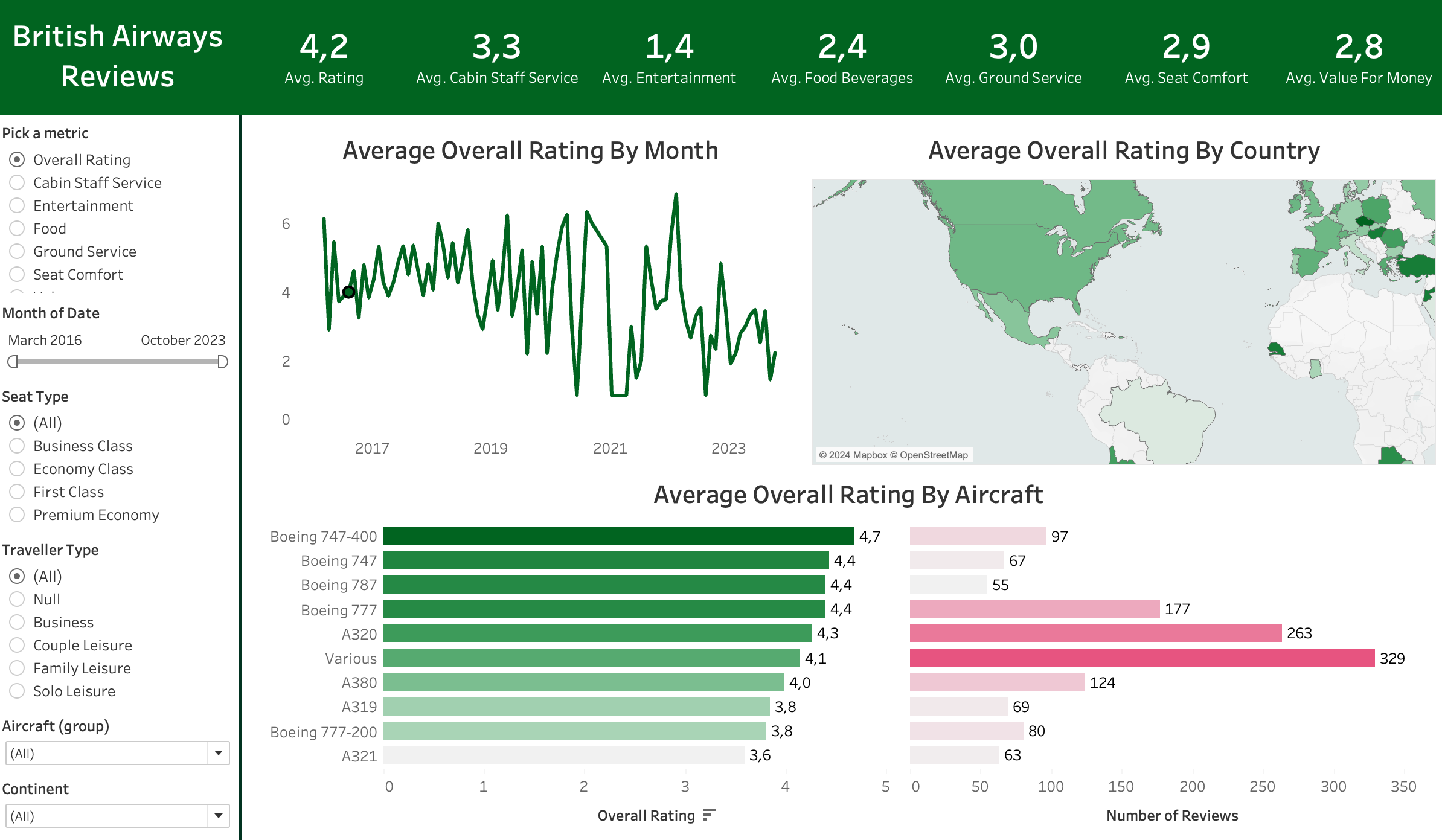
Project Overview: I developed an end-to-end data visualization dashboard using Tableau, designed to provide a highly interactive user experience. This project demonstrates my ability to create dynamic and insightful data visualizations.
Skills and Concepts
- Dynamic Metric Selection: Users can switch between metrics such as overall ratings, food ratings, entertainment ratings, and more with a simple click.
- Versatile Filters: Includes filters for date, traveler type, seat type, aircraft type, and continent, allowing for detailed data exploration.
- Interactive Visuals: Visual elements serve as dynamic filters, making it easy to focus on specific data points by clicking on countries, aircraft types, or specific months.
Technical Details
- Data Integration: Combined reviews data with a countries table to enable geographic filtering.
- Comprehensive Metrics: Included metrics like seat comfort, cabin staff service, food, beverages, ground service, value for money, and entertainment.
- Dashboard Interactivity: Implemented various filters and interactive elements to enhance user experience and data accessibility.
Skills Demonstrated
- Proficiency in Tableau: Creating interactive dashboards.
- Data Integration and Manipulation: Handling complex datasets.
- Designing User-Friendly Interfaces: Implementing dynamic filtering capabilities.
Conclusion
This project showcases my data visualization skills and my ability to create tools that facilitate in-depth data analysis. It highlights my proficiency in using Tableau to develop interactive, insightful, and user-centric dashboards.
Dashboard
You can view the dashboard project on here.